Chart Options for Analyzer reports

The Chart Options dialog box is available if you have a visualization applied to your report. Click Chart Options in the Properties panel to bring up the chart options for that report. You can click Apply to update your report with your changes up and continue working with the Chart Options. After setting options for your chart, click OK. The report will refresh to reflect the options.
General tab in Chart Options
The General tab is where you can set background colors, fonts, or the domain limit for the maximum number of plot values for your report.
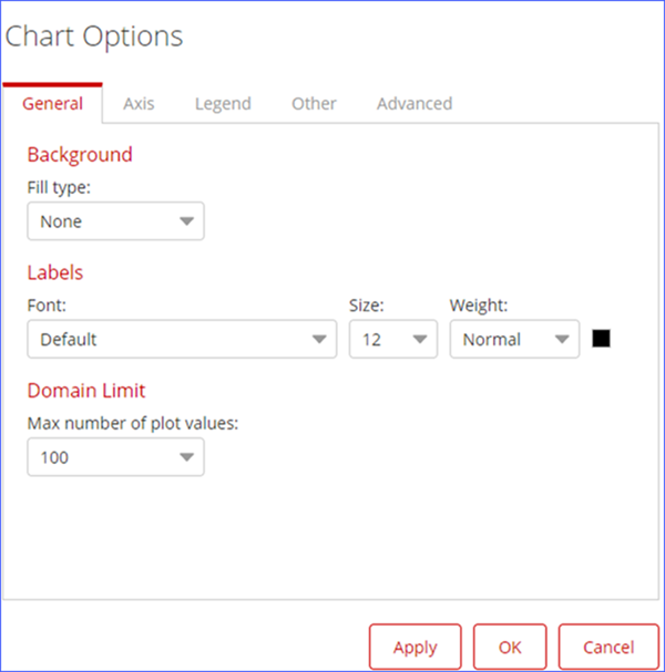
Fill in the following options for your chart in the tab:
| Option | Description |
| Background |
Fill type defines the background color of the chart and the fill colors used. Select None, Solid, or Gradient with the drop-down menu. |
| Labels | Use the drop-down menus to choose a font for your data labels, specify the size and type for the font, and change the font color with the color picker. |
| Domain Limit | Max number of plot values: Use this to set the maximum number of plot values used in your report. |
Axis tab in Chart Options
The Axis tab is where you can define how the x-axis and y-axis appear on your report.
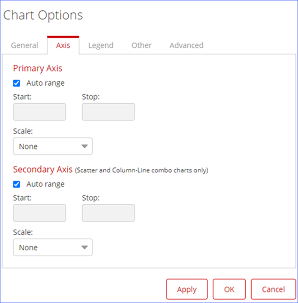
Fill in the following options for your chart in the tab:
| Option | Description |
| Primary Axis | Auto Range check box: Calculates the
Start and Stop value
automatically. If you want to specify the values, uncheck the box and fill out the
Start and Stop fields.
|
| Secondary Axis | Available for Scatter and Column-Line Combo charts only. Secondary Axis has the same options as Primary Axis. |
Legend tab in Chart Options
Use the Legend tab to customize the look of the legend of your report.
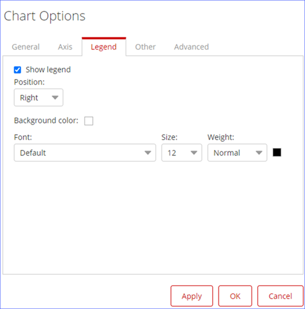
Fill in the following options for your chart in the tab:
| Option | Description |
| Show legend | Clear this box to remove the legend from your report. |
| Position | Use the drop-down to move the legend to the Top, Right, Bottom, or Left of your report. |
| Background color | Use this to change the background color of the legend. Click on the Background Color box to bring up the color picker. |
| Font | Use the drop-down menus to choose a font for your data labels, specify the size and type for the font, and change the font color of the legend. |
Other tab in Chart Options
Use the Other tab to tailor the look of the small charts for your report, if you have the Multi-Chart option selected. You can alter the size of negative values, or specify how you want Analyzer to show empty cells in your report.
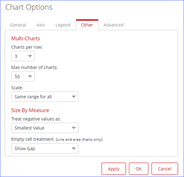
Fill in the following options for your chart in the tab:
| Option | Description |
| Multi-Charts |
Charts Per Row: Select from the drop-down menu to specify how many multi-charts on each row appear. Scale: Use the drop-down menu to set the axis range for your multi-charts. You set the same range for all of the small charts or set them independently. |
| Size By Measure |
Treat negative values as: Use the dropdown menu to choose either Smallest Value or Absolute. Empty cell treatment (Line and area charts only): Controls how empty cells appear in your Line and Area charts. Choose from Show Gap, Connect with Dotted Line, or Treat as Zero. |
Advanced tab in Chart Options
Use the Advanced tab to configure visualization views at the report-level using configuration rules.
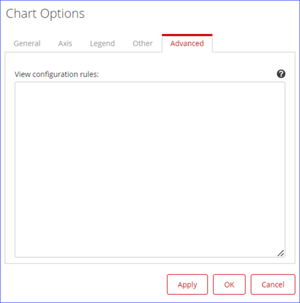
Procedure
Click the
 icon to open the Pentaho Analyzer document.
The Pentaho Analyzer document contains details about configuring the visualizations for charts. This document also contains the sample codes for configuring different types of charts.
NoteYou can also access the CCC (Community Charting Components) playground and documentation for more sample codes to configure required visualization of charts. The link to the CCC playground is available in the Pentaho Analyzer document.Copy the sample code to the View configuration rulesfield, and modify as required.
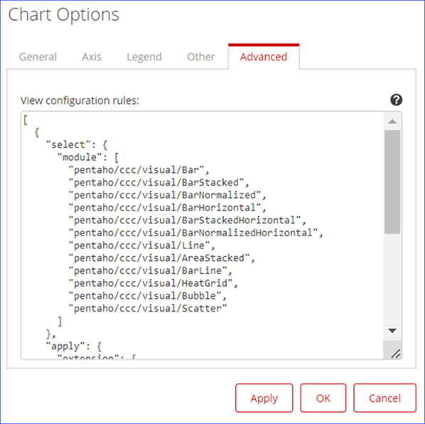
Click Apply, and then click OK.
The changes are applied, and the visualization of the chart is updated as per the configured code.