Visualizations for Analyzer

After you have created an analysis report, you will most likely want to make the report more visually pleasing and meaningful for your audience. Analyzer has quite a few built-in visualizations that give you an effective means for presenting your data in a way that people can intuitively understand. We also give you many different ways to customize your visualizations.
Both the Layout and Property panels in the Analyzer workspace dynamically change based on the visualization that you currently have selected. The Layout panel shows you what data is needed for that particular visualization, and the Property panel lets you add or change options such as data labels, color patterns, or bullet styles.
The optional properties for each visualization type are listed in each section. You can use any or all of these properties for each visualization to make your report more intuitive for your audience. The Chart Options dialog box contains more ways to customize your reports.
Continuous scale axis
Line, Area, and Scatter charts provide the number and time dimensions on a continuous scale axis. The continuous axis is helpful for identifying trends that occur over a period of time, such as financial growth, real estate sales, or test scores.
For a level of a time hierarchy to be plotted on a continuous scale, the level must be able to provide start date times for its members. You can use either of these methods to provide the start date times:
- Base the level directly on a date-related database column and set the level's key column data type to: Date, Timestamp, or Time.
- Use the level to provide start date times for its members by specifying the AnalyzerDateFormat annotation.
Column and bar charts
Column and bar charts are among the most
recognizable visualizations for data. Column charts display their data vertically, while bar
charts display the same data horizontally.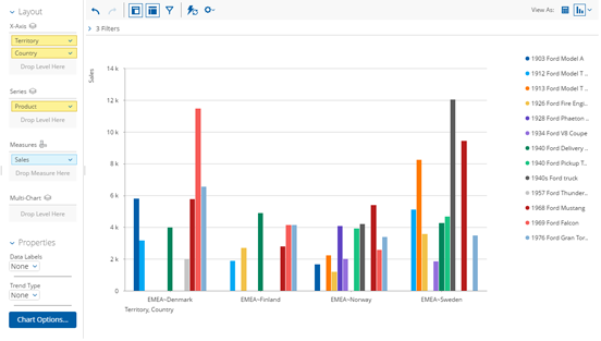
Column and bar charts are good for just about every kind of data; however, they tend to
work best when you do not have a large number of variables to display. Drilling down into
your data is easy: just double-click on a column or bar in the report. 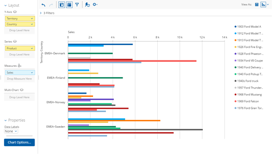
| Property | Definition | Available In |
| Data Labels | Use this to label the data features of your report with what is represented. You can also choose to display no data labels, or specify where you want them to appear. | All column and bar charts |
| Column or Line Data Labels | Use this to put data labels on your columns or lines, or both. | Column/Line combo charts |
| Trend Type | Shows a trend type of none or linear. If you choose linear, you can name your trend line and set the width of it. | Column charts |
Line and area charts
Line and area chart visualizations show data on a graph by connecting plotted points with a line. Each point represents a single value in your data. You can drill-down in both chart types by double-clicking on a data point.
A line chart shows just the line connecting the dots on the graph and works well if you
have a large amount of data to analyze.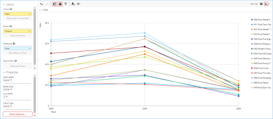
An area chart shows an aggregate of your data and helps you spot trends quickly, by showing
totals and how they are moving relative to each other. 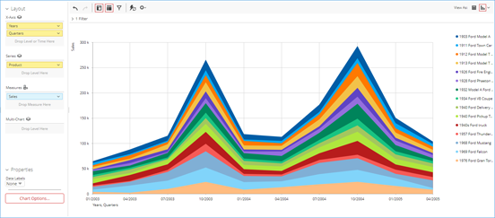
| Property | Definition | Available In |
| Data Labels | Use this to label the data features of your report with what is represented. You can also choose to display no data labels, or specify where you want them to appear. | Line and Area Charts |
| Bullet Style | Choose the shape that you want to use for your bullets. | Line charts |
| Line Width | Specify the width lines on your report. | Line charts |
| Trend Type | Shows a trend type of none or linear. If you choose linear, you can name your trend line and set the width of it. | Line charts |
Pie and sunburst charts
Pie charts are round representations of your data, cut into slices. Each slice represents a piece of data, and the size of the slice is proportionate to the data that it represents. Double-clicking on a slice lets you drill down into your data.
Pie charts are a great way to show numerical or financial data, in other words, what
something is worth relative to the whole group. 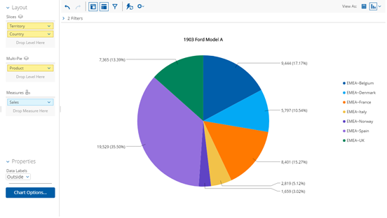
Sunburst visualizations organize and display your data in a series of colorful rings. Starting with the center ring, each ring going outward represents more detailed information relating to the inner ring to which it is connected. These outer rings are arranged and colored to indicate their hierarchical relationship with the inner ring. Any fields that contain empty slices can be shown as gaps in the sunburst.
You can drill-down into your data by double-clicking on a data slice. The sunburst then rearranges itself to show the more detailed information.
Sunburst visualizations are particularly well-suited for numerical analysis of hierarchical
data. 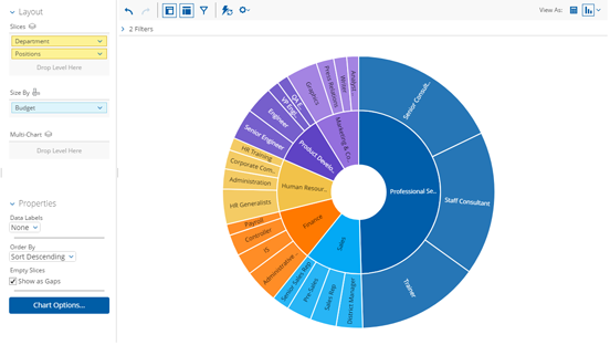
| Property | Definition | Available In |
| Data Labels | Use this to label the data features of your report with what is represented. You can also choose to display no data labels, or specify where you want them to appear. | Pie and sunburst charts |
| Order By | Allows you to decide how to sort your data on the report. | Sunburst charts |
| Empty Slices check box | Check this box to show Empty Slices as gaps in the report. | Sunburst charts |
Scatter chart visualization
Scatter charts are related to line and area charts, but show the intersection of x and y values at each data point. These values appear on the scatter chart as a series of bubbles on a graph, based on the attributes you used when you built your report. You can then use a measure to color-code the bubble or use a measure to specify the size of the bubble. Drilling-down is accomplished by double-clicking on any data point on the chart.
Scatter charts work well to show the categorical relationship between two sets of numerical
measures, such as between a budgeted amount and the actual amount of money spent. 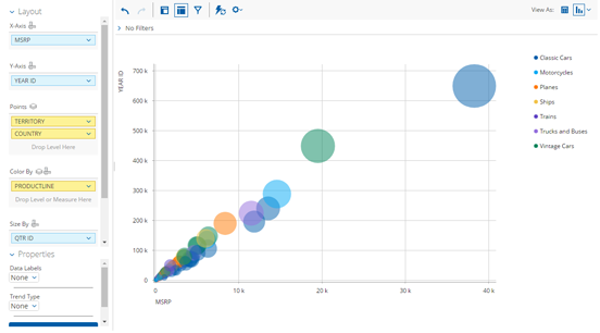
| Property | Definition | Available In |
| Data Labels | Use this to label the data features of your report with what is represented. You can also choose to display no data labels, or specify where you want them to appear. | Scatter chart visualization |
| Trend Type | Shows a trend type of none or linear. If you choose linear, you can name your trend line and set the width of it. | Scatter charts visualization |
Heat grid visualization
Heat grids give you the ability to visualize
data so you can identify patterns of performance. This visualization type will color-code
your results so you view complex business analysis in an easy-to-understand way. Drill-down
in your data by double-clicking any square on the grid. Heat grids are especially
well-suited for comparing categorical data using color. 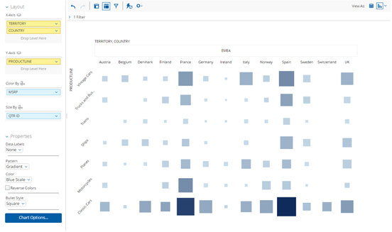
| Property | Definition | Available In |
| Data Labels | Use this to label the data features of your report with what is represented. You can also choose to display no data labels, or specify where you want them to appear. | Heat grid visualization |
| Pattern | Lets you choose from Gradient, 3 Step, or 5 Step patterns. | Heat grid visualization |
| Color | Choose from different mixes of colors for your report. | Heat grid visualization |
| Reverse Colors check box | Reverses the order of colors in the report. | Heat grid visualization |
| Bullet Style | Choose the shape that you want to use for your bullets. | Heat grid visualization |
Geo map visualization
Geo maps show a geographic summary of your data using size and color. This visualization type plots a pin on a map, based on the location attribute you used. You can add a measure to specify the size of the pinpoints, then use the properties panel to change the color of the pinpoints. Double-clicking on a pinpoint drills-down into your data. If your data model has geographic annotations, then the location information will be retrieved by the geoservice automatically. Geo maps are especially useful for retail or sales data.
You must have a license from Google if you choose to use Google Maps
with any Pentaho software. 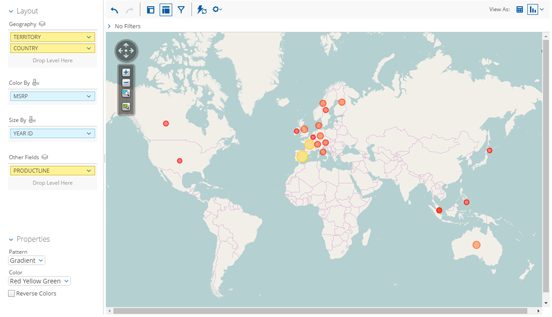
| Property | Definition | Available In |
| Pattern | Lets you choose from Gradient, 3 Step, or 5 Step patterns. | Geo map visualization |
| Color | Choose from different mixes of colors for your report. | Geo map visualization |
| Reverse Colors check box | Reverses the order of colors in the report. | Geo map visualization |