Tour the Report Designer interface

If you have little or no experience with Report Designer, then you will need to learn how to navigate the user interface before you can move on to more complex tasks. The content in this section provides a comprehensive yet brief introduction to all of Report Designer's user interface components.
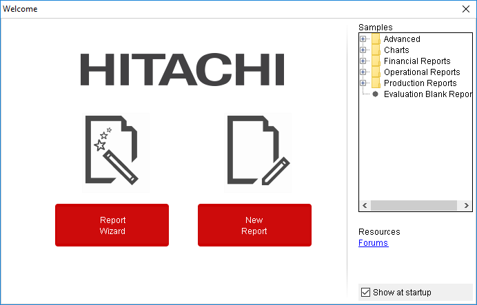
The Welcome screen
The Welcome screen's primary purpose is to provide new users a quick, four-step process that walks you through creating a new report through the Report Design Wizard. This is the default view when you start Report Designer, but if you close it, you can make it reappear at any time by going to the Help menu and selecting Welcome.
In addition to the new report creation buttons, the Welcome screen also shows a list of sample reports. You might find these useful if you're looking for inspiration, or if you can't figure out how to use a certain Report Designer feature. In order to display the samples, you must have the Pentaho sample data HSQLDB database installed and running.
If you do not want to see the Welcome screen at start up, you can uncheck the Show at startup option in the lower right corner of the window.
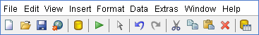
The Report Designer main toolbar
The toolbar at the top of the Report Designer window is for file, data, publishing, and cut-and-paste operations. The toolbar makes some of the most frequently used features more accessible to users who have not yet learned keyboard shortcuts for them. There are no unique data, publishing, or file operations in the toolbar; every icon represents a feature that is also available through one of the panes or menus in Report Designer.
To discover what each icon does, mouse over it to see a tooltip description.
Defining preferences
To edit preferences associated with date and time format, look-and-feel, browsers, networks, external tools and locations go to . Enable Display the index columns in the Report Designer's field selectors... to refer to data fields by name or column position. For more information, see Referring to Report Elements by Name or Column Position.
Report Designer's tabbed views
Each report is opened in its own tab in Report Designer, much like in modern Web browsers and text editors. Click the X in the corner of a tab to close the open report it represents, or right-click the tab to see a context menu that offers more advanced close operations.
The button bar below the tab area offers font and preview options. The eye icon switches to preview mode, which shows you approximately how the report, as currently arranged, will display when published. When you are in preview mode, the eye turns into a pencil icon; click it to return to design mode.
The rest of the functions in this bar are standard font controls found in most text editors and word processors. The list of font types is pulled from your Java Runtime Environment's fonts directory and from the TrueType fonts registered with your operating system or desktop environment.

The report workspace
The workspace is dominated by the layout bands, which define each individual portion of the report. The currently selected band's label will always be highlighted in gray, as shown with the page header band in the graphic below.
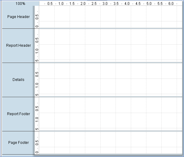
The following bands of the Report Designer are:
Page Header
represents the top of each report page. On the first page of a multi-page report, the page header is at the absolute top, above the report header.
Report Header
contains report elements just below the page header, but only on the first page of the report. The report header only appears once per report; it is not repeated on subsequent pages in the same report.
Details
contains middle-of-the-page report elements. This is where most of your report data should go, and ordinarily represents the largest portion of your report pages.
Report Footer
appears at the bottom of the last page of the report, just above the page footer. Like the Report Header, it only appears once per report.
Page Footer
appears at the bottom of every page in a report.
You can also create groups for various report elements, with each group having its own header and footer bands in the workspace. All of the report bands can be resized by dragging their resize handles, or by moving report elements down past the bottom border. For this reason, report elements cannot be dragged from one band to another; they must be cut from the first band and pasted into the second.
If you would like to change the size of the layout bands to give yourself more area to work in without changing the dimensions of the published report, you can click and drag the percentage number in the upper left corner of the workspace. By default it says 100%, but if you click and drag it diagonally toward the upper left or lower right corners, the view will zoom in or out. If you want to reset the view to 100%, double-click the upper left corner where the percentage shows.
The Structure pane
The Structure tab shares a pane with the Data tab in the upper right section of Report Designer. The Structure pane shows the exact hierarchy of every element included in a report. If you add an element to the workspace, it will show up in the Structure pane; when selected there, all of its fine-grained details can be viewed and modified through the Style and Attributes panes in the bottom right section of the screen. In addition to the standard drag-and-drop method using the palette and the workspace, you can also add an element to a report by right-clicking on any of the report sections in the Structure list, then selecting Add Element from the context menu. You can delete any element in the list by clicking on it, then pressing the Delete key, or by right-clicking it and selecting Delete from the context menu.
Master report or sub-report
This is the top-level category under which all other report bands are listed. For standalone or master reports, this will be the Master Report. For sub-reports, it will be the sub-report.
| Report Band | Description |
| Page Header | All of the elements shown in the page header band are listed in this category. |
| Report Header | All of the elements shown in the report header band are listed in this category. |
| Group | If you've created any groups for your report elements, they will show up here. You can add or delete a group by right-clicking the Groups heading, then selecting the appropriate action from the context menu. You can also delete a group by selecting it, then pressing the Delete key. Your Details band is considered a group, and is explained below. |
| Details | All items you place in the Details band will appear in the Details heading under the Group section. There are also Details-specific Header and Body bands which are not displayed in the workspace by default, but are available in the Structure pane to add to. You can add these extra bands to your workspace by selecting each of them in the Structure pane, then clicking the checkbox next to hide-on-canvas in the Attributes pane. |
| No Data | In the event that your query does not return any data, whatever content you put into the No Data band will appear in your report. You can add a no data band to your workspace by selecting No Data Band in the Structure pane, then clicking the checkbox next to hide-on-canvas in the Attributes pane. |
| Report Footer | All of the elements shown in the report footer band will be listed in this category. |
| Page Footer | All of the elements shown in the page footer band will be listed in this category. |
| Watermark | You can add a watermark to your report by clicking Watermark in the Structure pane, then either right-clicking it and adding an element directly through the Structure pane, or by clicking the checkbox next to hide-on-canvas in the Attributes pane and dragging an element to the new Watermark band. |
The Data pane
The Data pane enables you to add data sources and view the individual queries, functions, and parameters in each report. The three buttons at the top of the pane will add a new data source, function, or parameter when clicked, respectively.
Data sets
All of the data sources and queries you have defined for the current report will be listed here. If you want to add a new data source, click the leftmost icon (the yellow cylinder) and select the data source type from the ensuing drop-down menu. To add a new query to an established data source, right-click the data source and then select Edit DataSource from the context menu. To delete a data source, select it, then press the Delete key, or right-click it and select Delete from the context menu.
Functions
All of the mathematical functions and conditional elements that you add to a report will be listed in this category.
Environment
If you are publishing your report to the Pentaho Server, you can use the following server environment variables in your report:
| Variable | Description |
| hostColonPort | The hostname and port number for the Pentaho Server service |
| pentahoBaseURL | The complete URL to the Pentaho Server, as set in the Base URL property |
| roles | Returns a comma-separated list of roles that the Pentaho Server user who is currently running this report belongs to |
| roles-array | Returns a Java array of strings containing the roles that the Pentaho Server user who is currently running this report belongs to |
| serverBaseURL | The URL to the Pentaho Server, minus the Pentaho Server application context name (the default context is pentaho/) |
| solutionRoot | The path to the top-level Pentaho solution directory. The default location is home/pentaho/pentaho/server/pentaho-server/pentaho-solutions/ on Linux and Solaris, and C:\pentaho\server\pentaho-server\pentaho-solutions\ on Windows |
| username | Returns the Pentaho Server username of the person currently running the published report |
Parameters
If your query is properly formed, you can add a parameter to your report, which enables report readers to customize the content of the output. To add a new parameter, click the rightmost icon in the upper left corner of the pane. You can delete parameters by selecting the parameter you want to eliminate and pressing the Delete key, or by right-clicking the parameter and selecting Delete from the context menu.
The Style pane
The Style pane displays all of the visual and positional style options for any given item in the Structure pane.
The Attributes pane
The Attributes pane displays all of the low-level properties, and input and output options for any given item in the Structure pane.
The Palette
The Palette contains all of the elements that you can use to build a report. To add an element, click on a layout band to select it, then drag and drop an element from the Palette to the selected band. Each of the report elements is described in detail below:
| Report Element | Description |
| Label | A static text string. You can set and change it by hand as many times as you like, but it cannot be changed dynamically through a query or function. |
| Text Field | A textual report element that is dynamically changed through a query or function. |
| Number Field | Displays dynamic numerical data from a query. |
| Date Field | Handles date information from a query. |
| Message Field | An element that combines multiple static and dynamic report elements such as labels and text fields, etc. |
| Resource Label | Static text string that maps to a resource bundle, allowing you to localize a label element based on locale. |
| Resource Field | Dynamic text string that maps to a resource bundle, allowing you to localize any database field. This is particularly useful when you have multiple fields for multiple languages and need to implement some kind of logic to choose among them based on locale. |
| Resource Message | Dynamic text string that concatenates data from multiple types, and dynamically maps to a resource bundle, allowing you to localize a report based on locale. |
| Image Field | A reference to an image stored in a database. |
| Image | A static image embedded into a report from an accessible location. |
| Ellipse | A vector graphical element with no angles. |
| Rectangle | A vector graphical element in the shape of a rectangle. |
| Horizontal Line | A vector graphical line segment, drawn horizontally. |
| Vertical Line | A vector graphical line segment, drawn vertically. |
| Survey Scale | A simple sliding scale chart element. |
| Chart | A chart or graph that shows your query results graphically. |
| Simple Barcodes | A barcode chart element. |
| Bar Sparkline | A bar sparkline chart element. |
| Line Sparkline | A line sparkline chart element. |
| Pie Sparkline | A pie sparkline chart element. |
| Band | A method of grouping elements. |
| Sub Report | An element that references another report. |